

You have control over the cookies used.
 You have control over the cookies used.
PCC-Grading uses cookies to improve your browsing experience and measure site usage. By clicking on "Accept all", you consent to the use of these cookies.

 Go back
 2 minutes of reading
Today, we explore... the worst card designs ever printed. Because even in a universe as colorful and polished as Pokémon TCG, there have been some artistic failures.
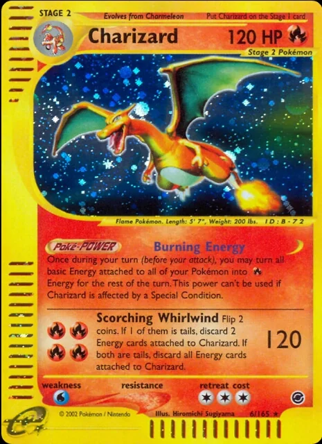
We start this top with a legendary card: Charizard. However, its illustration in the Wizards series of the Expedition expansion is largely a failure.
It was a common trend in the Wizards series cards, where many illustrations awkwardly mixed early 3D, resulting in sometimes awkward renderings. This Charizard is a perfect example.
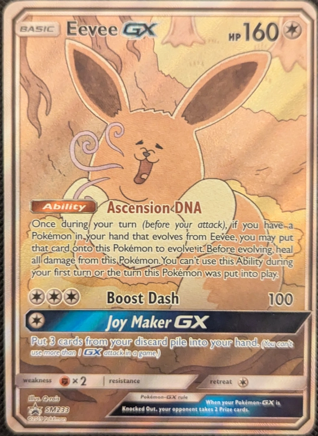
Let's continue our top with a Pokémon appreciated by the public, but surprisingly awful for the launch of the new Sun and Moon series: Eevee.
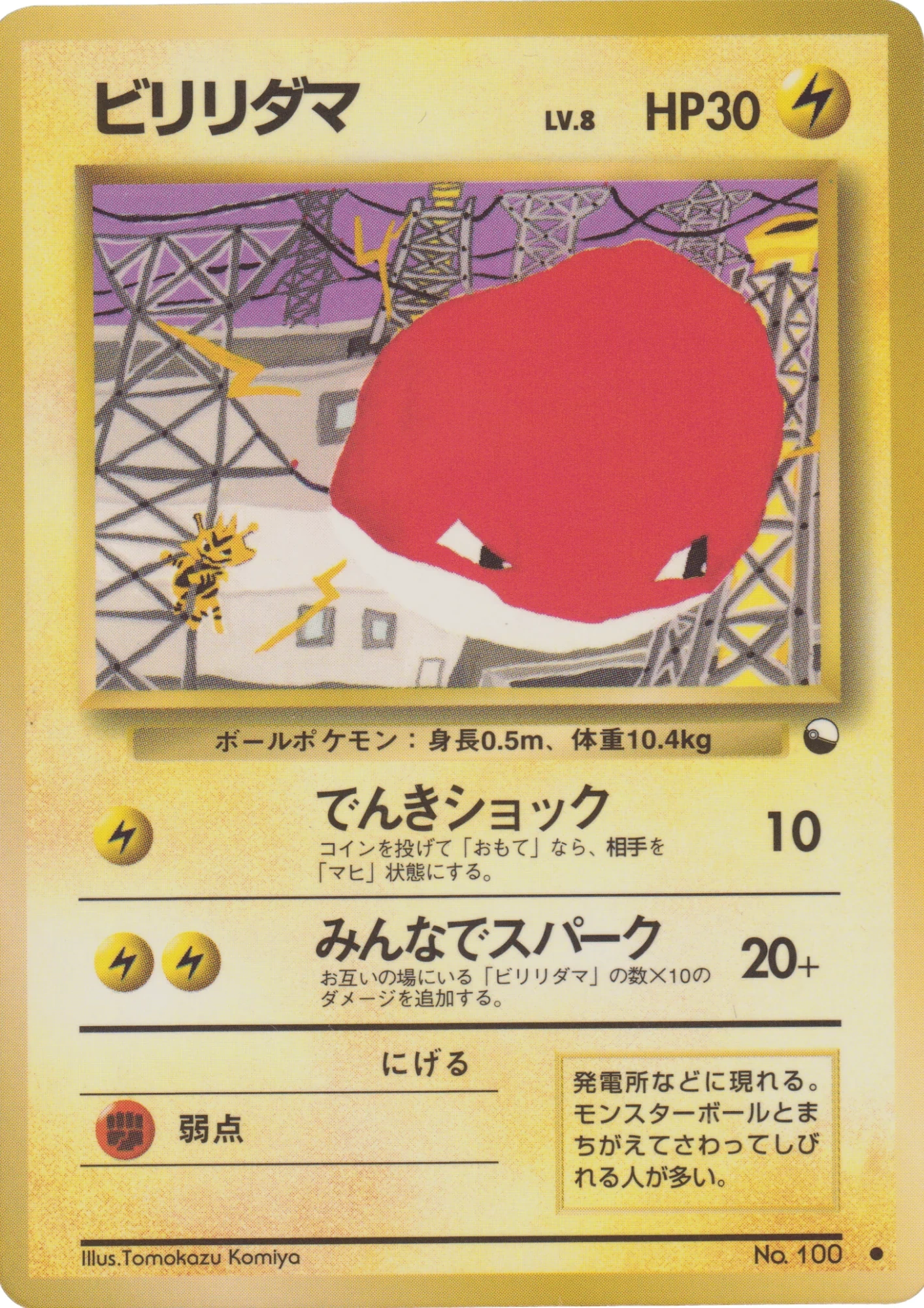
Let's continue with an old card exclusive to Japan: Voltorb. Its unique design and exclusivity make it an interesting piece for collectors, although its illustration may divide opinions!
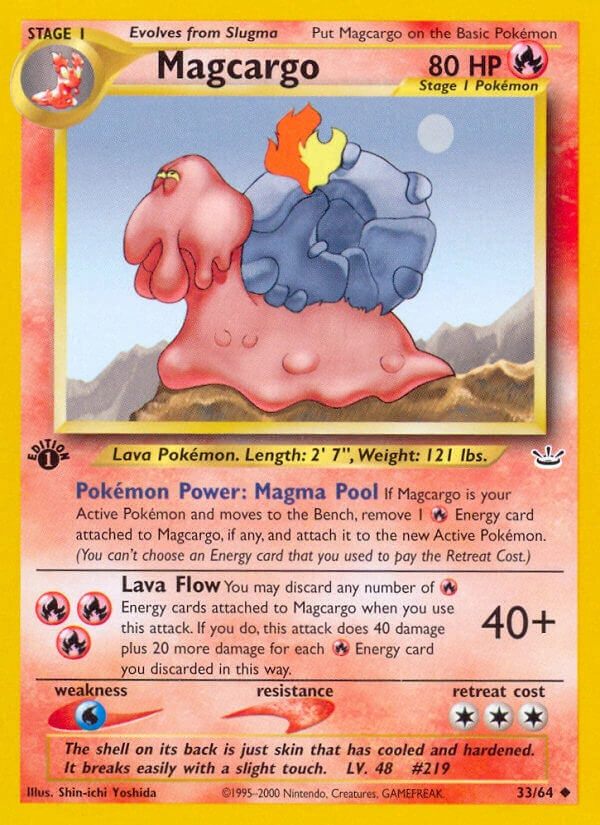
Volcaropod, a Pokémon full of character, seems unrecognizable here. In this illustration, it looks tired and without energy, which contrasts with its usually fiery and determined appearance.
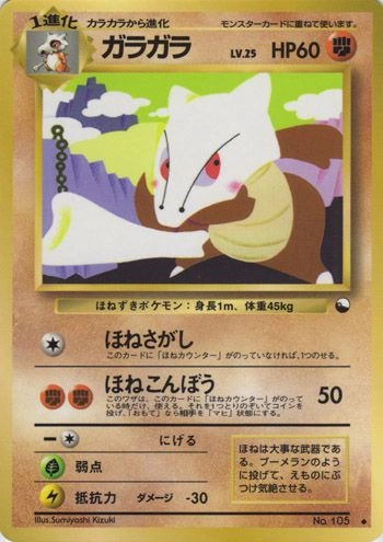
This Marowak, available only via vending machines in Japan (fortunately!), looks quite dull. Its illustration lacks depth, and its red cheeks contrasting with its bone skull give it a strange and unnatural look.
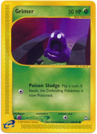
This Grimer, with a very atypical style, well illustrates the hesitant beginnings of 3D. Its appearance lacks naturalness, and it almost looks afraid of itself!
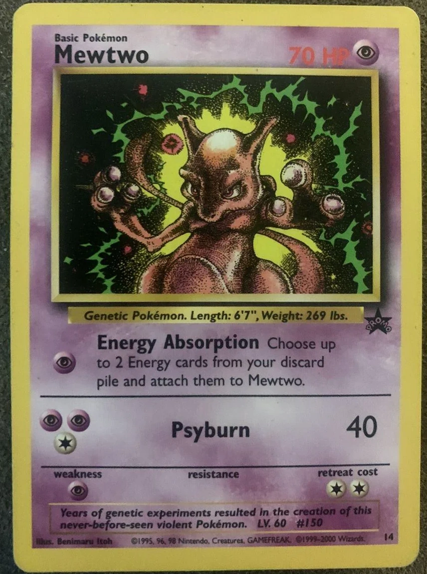
Mewtwo, a majestic Pokémon, is far from its usual charisma here. Its illustration shows it too dark and dull, with a slouched posture that does not do it justice. This is clearly not the best showcase of this legendary Pokémon.
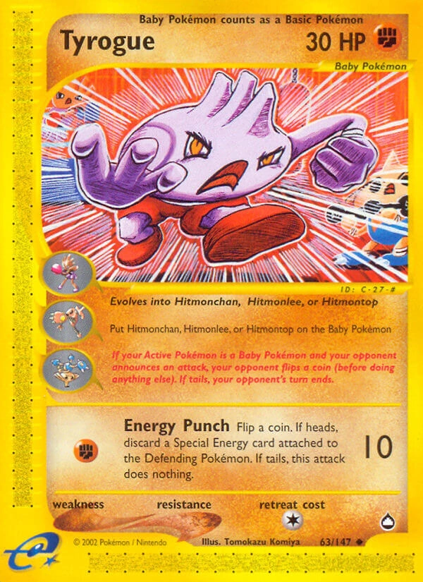
This Drowzee looks so undetailed that its design becomes simplistic. Its posture, hiding its torso, gives the impression of a lack of depth and dynamism. Add to that rough lines and uninspired staging, and you get an illustration that does not highlight this Pokémon full of potential at all.
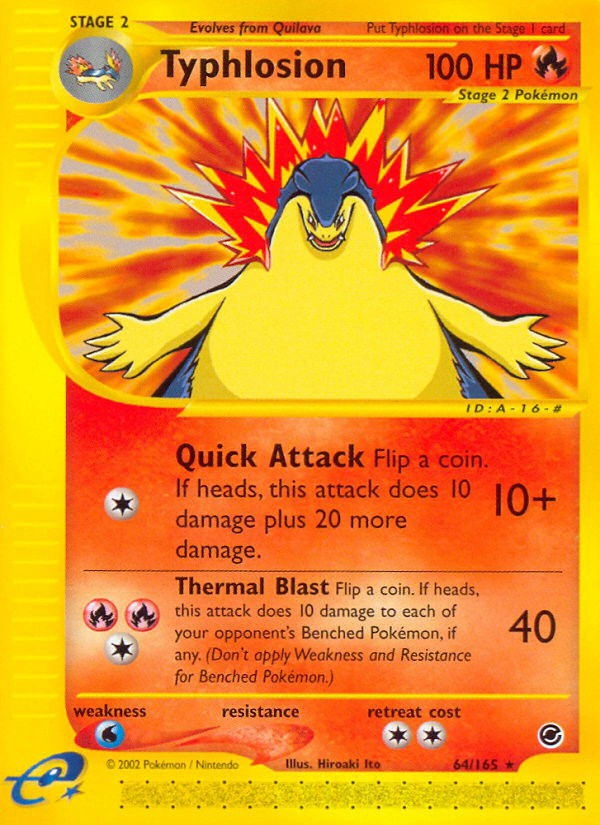
Typhlosion, a third evolution Pokémon, is supposed to exude charisma and power. Yet, this illustration clearly does not flatter it. The low-angle shot emphasizes its belly more than its face, making it lose presence. Instead of inspiring fear and respect, it seems almost clumsy, which harms the formidable aura it should have.
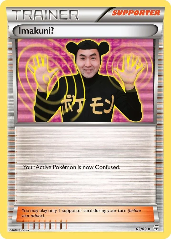
Imakuni cards in Pokémon are special and humorous cards featuring Imakuni?, an eccentric and enigmatic character.
Imakuni? (イマクニ?) is a real Japanese musician and artist, known for his quirky style and strange performances.
Imakuni? cards are a tribute to an eccentric artist who marked the Pokémon universe with his crazy humor. They remain prized collectibles for their rarity and unusual nature.
Grading
Company specialized in TCG card grading, we use an advanced tool to evaluate the condition, centering and details of the cards. Guarantee of an accurate and reliable rating to enhance your collections.


