You have control over the cookies used.
 You have control over the cookies used.
PCC-Grading uses cookies to improve your browsing experience and measure site usage. By clicking on "Accept all", you consent to the use of these cookies.

 Go back
 4 minutes of reading
Did you know that the iconic Pokémon logo, recognizable worldwide, was created in one month by an independent designer? In recent interviews, Chris Maple at IGN, the little-known creator of the logo, finally shared the fascinating story of its design. An adventure marked by urgency, intuition, and unexpected global success.
Today, we retrace the journey of this design that became a legend.

In February 1998, Chris Maple, a Seattle-based designer, received a call from the secretary of Minoru Arakawa, then president of Nintendo of America. He was offered an urgent mission: to design the logo for a game called Pokémon (Western adaptation of Pocket Monsters) for its international launch.
• Extreme constraints: Maple had only one month to deliver the logo, compared to the usual 6 months. Previous agencies had failed, and the budget was almost exhausted.
• Limited inspirations: He was given a box filled with toys (including a miniature Pikachu), sketches, and an issue of Nintendo Power magazine. No playable version of the game was provided.
Maple started with the only instruction: the logo had to be legible on the tiny Game Boy screen and work in both black and white and color.
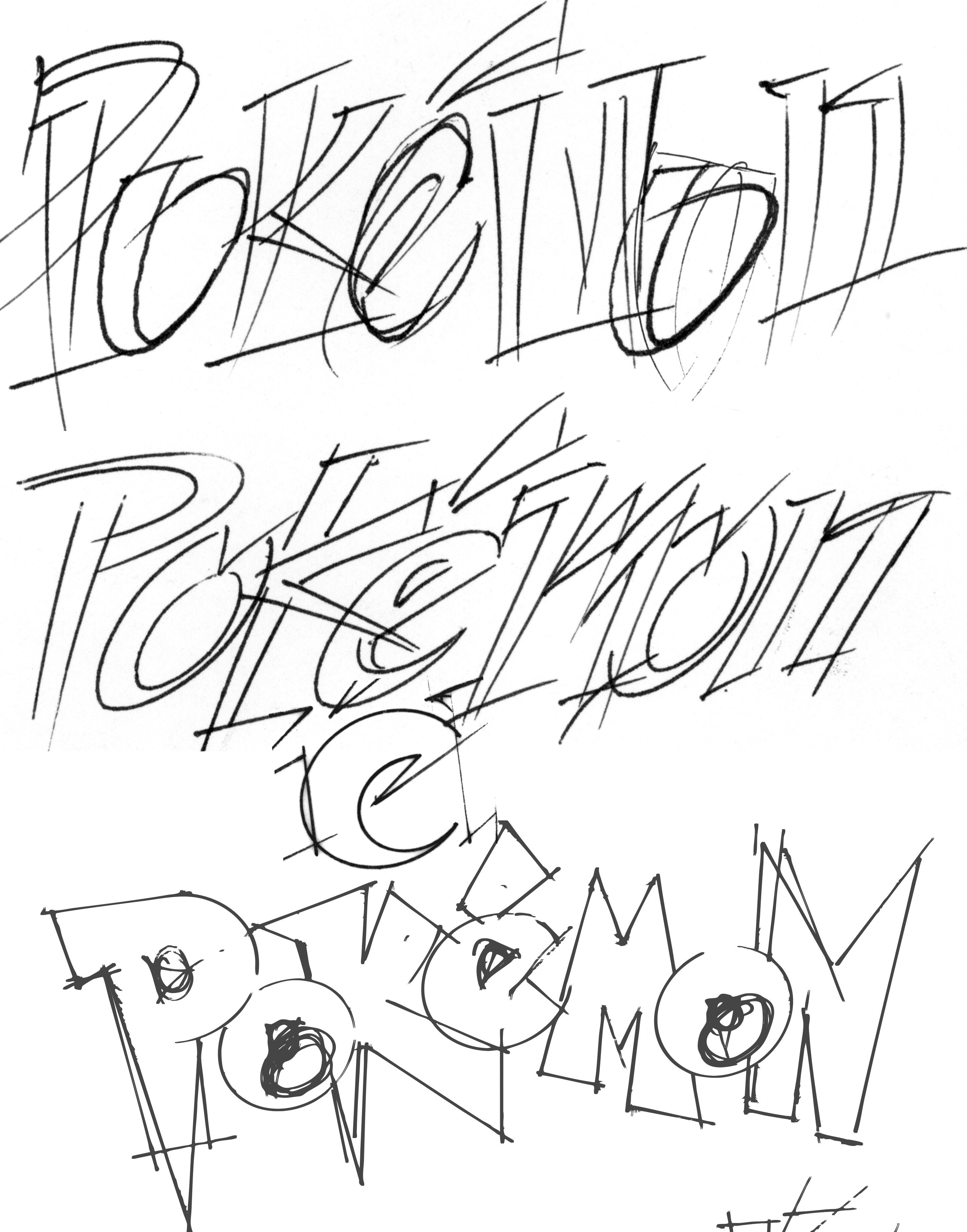
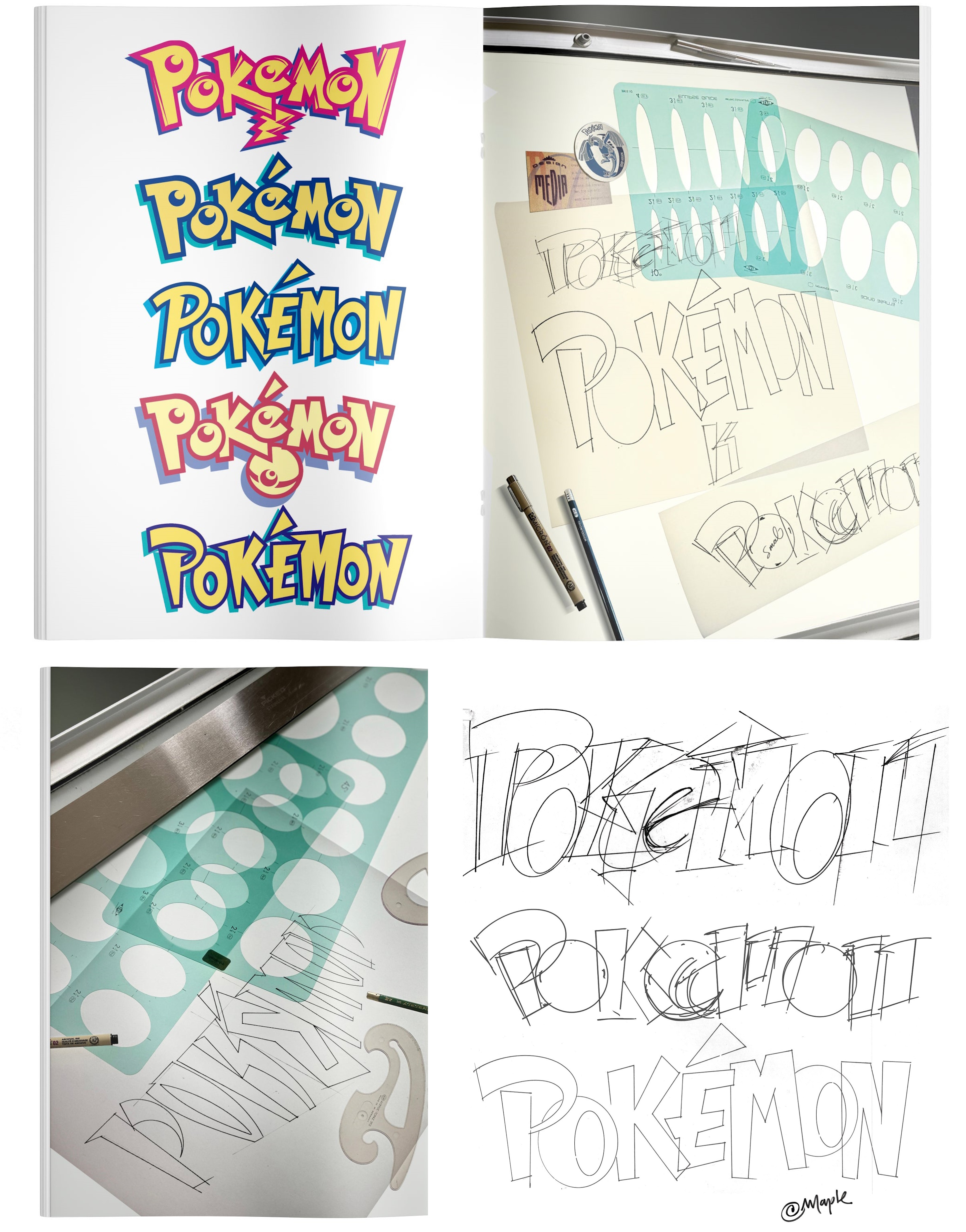
1. Hand-drawn design: He drew dozens of variations on a light table, testing letter shapes and colors.
2. Color choices: The yellow and blue of the final logo might be inspired by the Pokémon Blue and Yellow versions intended for the West, although Maple admits he followed his instinct: “It just had the right energy.”
3. Express validation: During the presentation at Nintendo, his favorite design was approved within seconds by Don James, VP of Nintendo of America: “This is the one. Produce it.”
The logo’s success is due to several factors:
• Simplicity: Dynamic typography and thick outlines for perfect readability, even in 8-bit.
• Versatility: Usable on game boxes, trading cards, TV ads, and even the pixelated screens of the Game Boy
• Emotion: The logo embodies the spirit of adventure and camaraderie of Pokémon, becoming a nostalgic symbol for generations of fans.
Maple remained silent for 27 years about his role, as is often the custom in the industry. It was his son who encouraged him to tell his story recently
• Other collaborations: After Pokémon, he worked on designs for Major League Baseball Featuring Ken Griffey Jr. and the Atomic Purple edition of the Nintendo 64.
• Retrospective pride: “I am proud to have contributed to the history of such an iconic brand,” he says today.
Maple’s story reminds us that:
1. Constraints stimulate creativity: A tight deadline and few resources gave birth to a universal design.
2. Intuition matters: No market research guided the color choices – just a feeling.
3. Adaptability is key: A good logo must work everywhere, from pixel art to billboards.
The Pokémon logo is much more than a drawing: it is the result of a bold collaboration between a talented designer and a team ready to bet on his instinct. Chris Maple, unknowingly, made history in gaming – and in millions of childhoods.
“The first time I saw my logo in a toy store, I said to myself: Damn, that’s crazy!”
Grading
Company specialized in TCG card grading, we use an advanced tool to evaluate the condition, centering and details of the cards. Guarantee of an accurate and reliable rating to enhance your collections.